Transformer addition or bay extension? How to read substation imagery right
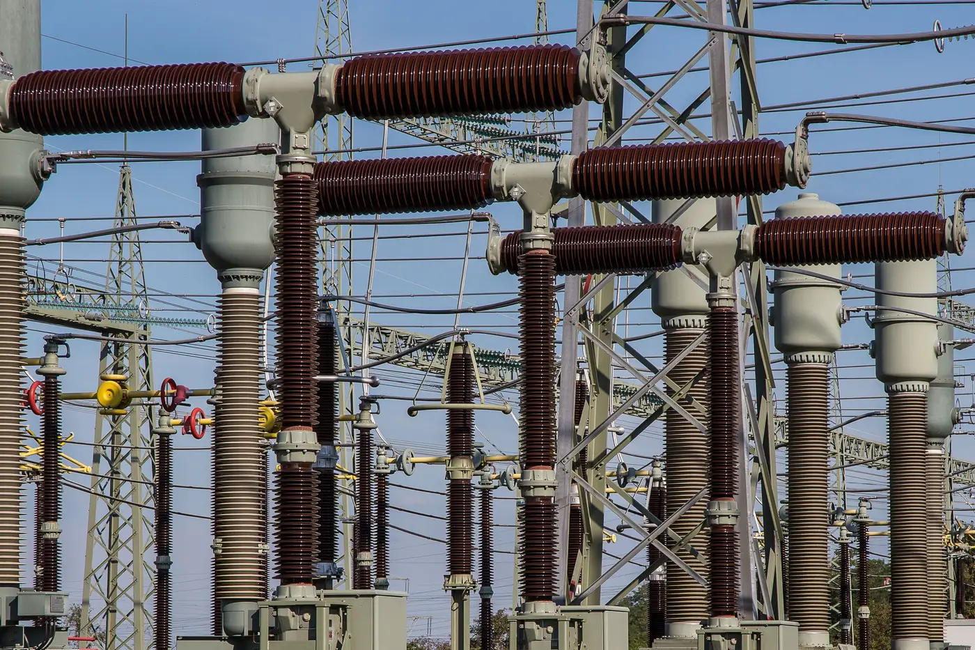
A new rectangle on a substation footprint doesn't tell you what changed. It could be a transformer addition that bumps MVA capacity at the site, or a bay extension that adds switching flexibility without adding a single megawatt. Mix the two up in a load forecast or an interconnection queue note and you've either overstated headroom or missed a real capacity signal. The good news is the imagery usually gives you enough to tell them apart, if you know which features to check.
What a bay extension actually looks like
A bay extension reads as more structure, not more iron. Look for a new row of steel gantry or a lattice extension running parallel to the existing bus, with breaker and disconnect positions spaced along it the same way the existing bays are spaced. The footprint tends to be long and narrow, often matching the width of the adjacent bay almost exactly, because it's built to the same bus geometry.
The new structure also lacks a square or circular pad at its end, an oil containment berm, and a cluster of radiator fins (fins read as a fine corrugated texture at sub-meter resolution, usually along one side of a transformer footprint). A structure that terminates in another breaker position, a tie line, or just extends the bus run toward open yard space signals switching capacity at the site. Utilities add bays to prep for a future line, to split a bus for reliability, or to add a spare breaker position. None of that moves MVA.
What a transformer addition looks like
A transformer footprint is a different shape entirely. You're looking for a compact rectangular or square pad, usually set apart from the bus structure by a gap wide enough for truck access and maintenance clearance. The containment ring or berm around it shows up as a visible border, sometimes a double line if there's a gravel apron inside a concrete curb. Radiator banks sit off one or two sides of the pad like fins, and if the imagery catches a clear day with decent sun angle, the bushings on top cast short, regular shadows in a row, three per phase on most designs.
Scale matters here too. A new transformer pad footprint at a bulk transmission site runs considerably larger than a breaker or disconnect pad, big enough to hold the tank, the radiators, and the cooling fan array (which also shows up in imagery as small round silhouettes along the radiator bank). If what you're seeing is roughly the same footprint as the three or four existing transformers at the site, lined up in the transformer row rather than the switching yard, that's capacity worth flagging.
Where the read gets harder
A few things muddy this. Spare transformer pads built for future phases sit empty for years and show as bare concrete, easy to mistake for a parking or laydown area until a tank shows up on a later pass. Construction staging for a bay extension sometimes includes a temporary pad for crane outriggers that looks square enough to second-guess yourself. Low sun angle or cloud shadow can hide the radiator texture that's your best single tell.
When one pass is ambiguous, the next pass usually resolves it. A transformer that arrives on site shows up fast, the tank and bushings go in as one lift, while a bay extension's steel work drags out over a quarter or two. Watching the change across more than one capture tends to resolve what a single frame can't.
This is the kind of read that's slow going site by site, especially if you're tracking build-out at substations you have no reason to be standing in front of, whether that's a neighboring utility's interconnection point or your own company's sites outside your assigned region. Grid Change Monitor runs that comparison for you, flagging new pads, bus extensions, and yard construction as a change list per site instead of a stack of imagery you have to eyeball cold.
If you'd rather get the change list than do the pixel-counting, that's what it's built for.